Work / VAEL-26
VAEL
Every acne-patch ad argues the patch is invisible. Vael's argument: the patch doesn't need to be — worn like jewelry, defended with a straight face so the person wearing it stays the main character, not a concealed problem.
Sector
Beauty · Skincare (spot treatment)
Deliverables
Campaign concept · 5 ad masters · character design
Formats
4:5 feed · 9:16 story
Production
AI production, art-directed · type set in Photoshop
Year
2026 · self-initiated
The Brief
What problem the campaign solves
Every acne-patch ad picks one of two tones: clinical (dermatology lighting, "targets blemishes fast") or apologetic (concealer-adjacent, hide-it-quick). Neither treats the person wearing it as someone who's fine.
Vael doesn't argue the patch is invisible. It argues the patch doesn't need to be. Worn like an earring, defended like it's obvious, dramatized like the whole category takes itself too seriously — because it does.
The device — repeats across every ad
Handled.
Five ads, one word. Each frame answers a different kind of overreaction — a safety box, a doorway, a diptych, a mirror, a beauty shot — so the set reads as one argument, not five images.
The Ads
Five roles, one straight face
VAEL-26 / 014:5 · Feed
Deadpan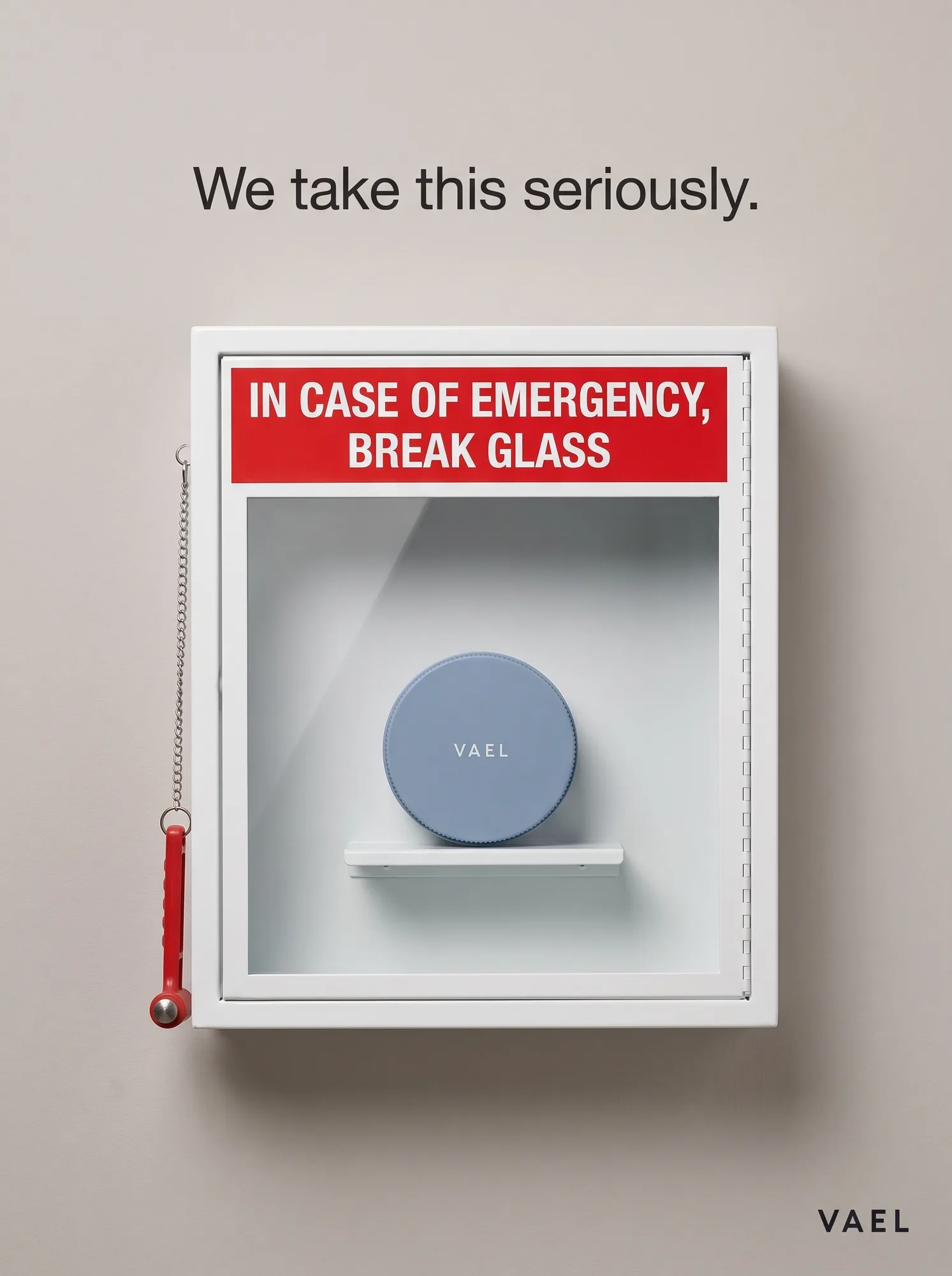
01 — Break Glass
An emergency break-glass box, hammer and chain included, protecting one small blue tin like it's fire equipment. The joke is played completely straight — deadpan is the entire craft.
Why it exists: Sets the tone for the whole set before anyone reads a headline: whatever this brand does with a pimple patch, it isn't going to apologize for it.
VAEL-26 / 024:5 · Feed
Character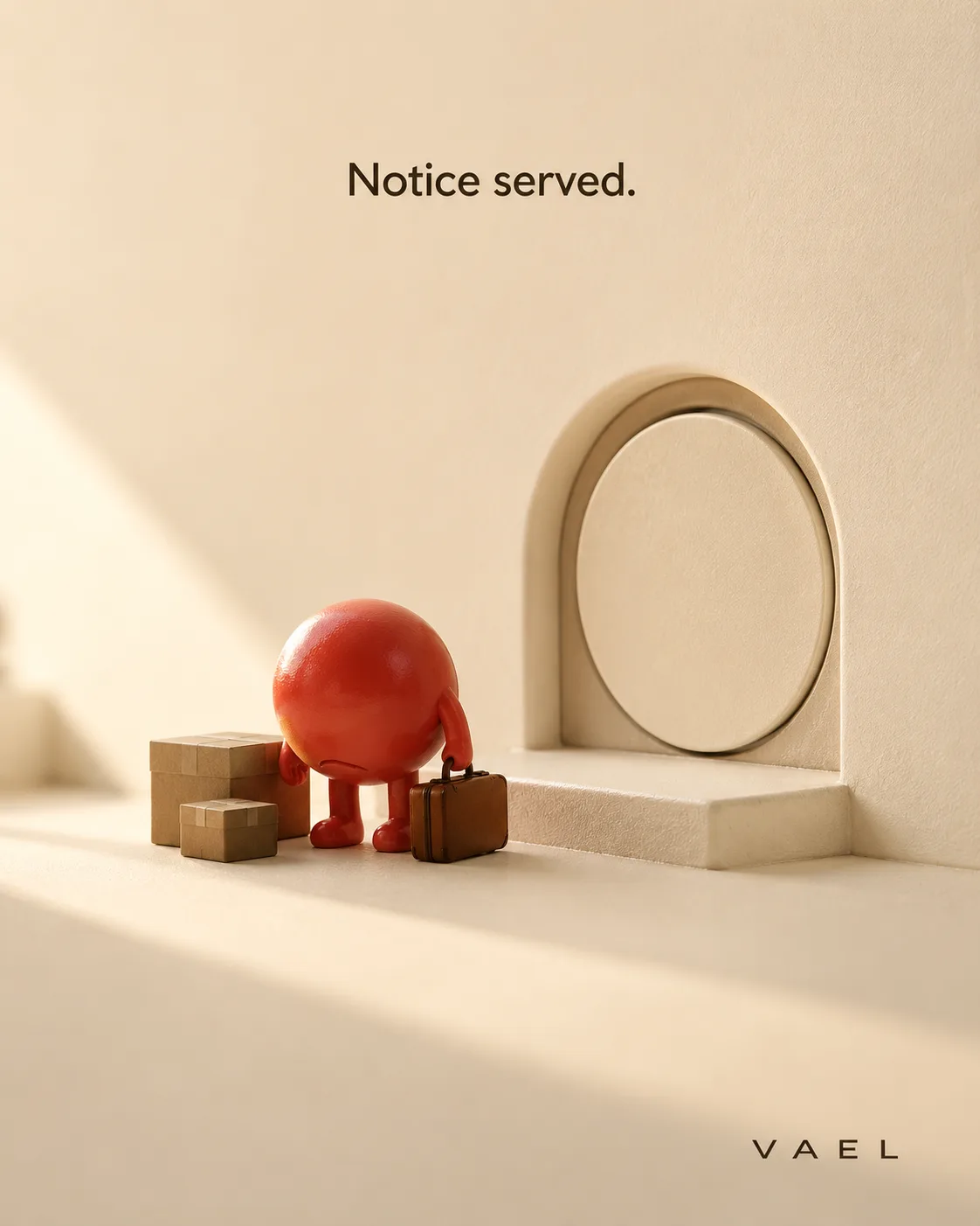
02 — Notice Served
A small red creature, suitcase in hand, evicted from a doorway now sealed shut by a single patch. Gentle, not cruel — the first appearance of Vael's recurring cast.
Why it exists: Gives the blemish itself a mascot, not the brand — the joke lands on the pimple, never on the person wearing the patch.
VAEL-26 / 039:16 · Story
Native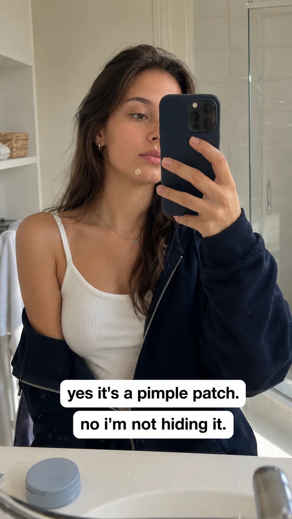
03 — Yes, It's A Patch
A real mirror selfie, mid-morning-routine, patch worn on the cheek without ceremony. Zero ad chrome — the caption carries the brand.
Why it exists: Built to pass the pattern-match test as real content before it reads as an ad, running to cold audiences who scroll past anything that looks produced.
VAEL-26 / 044:5 · Feed
Proof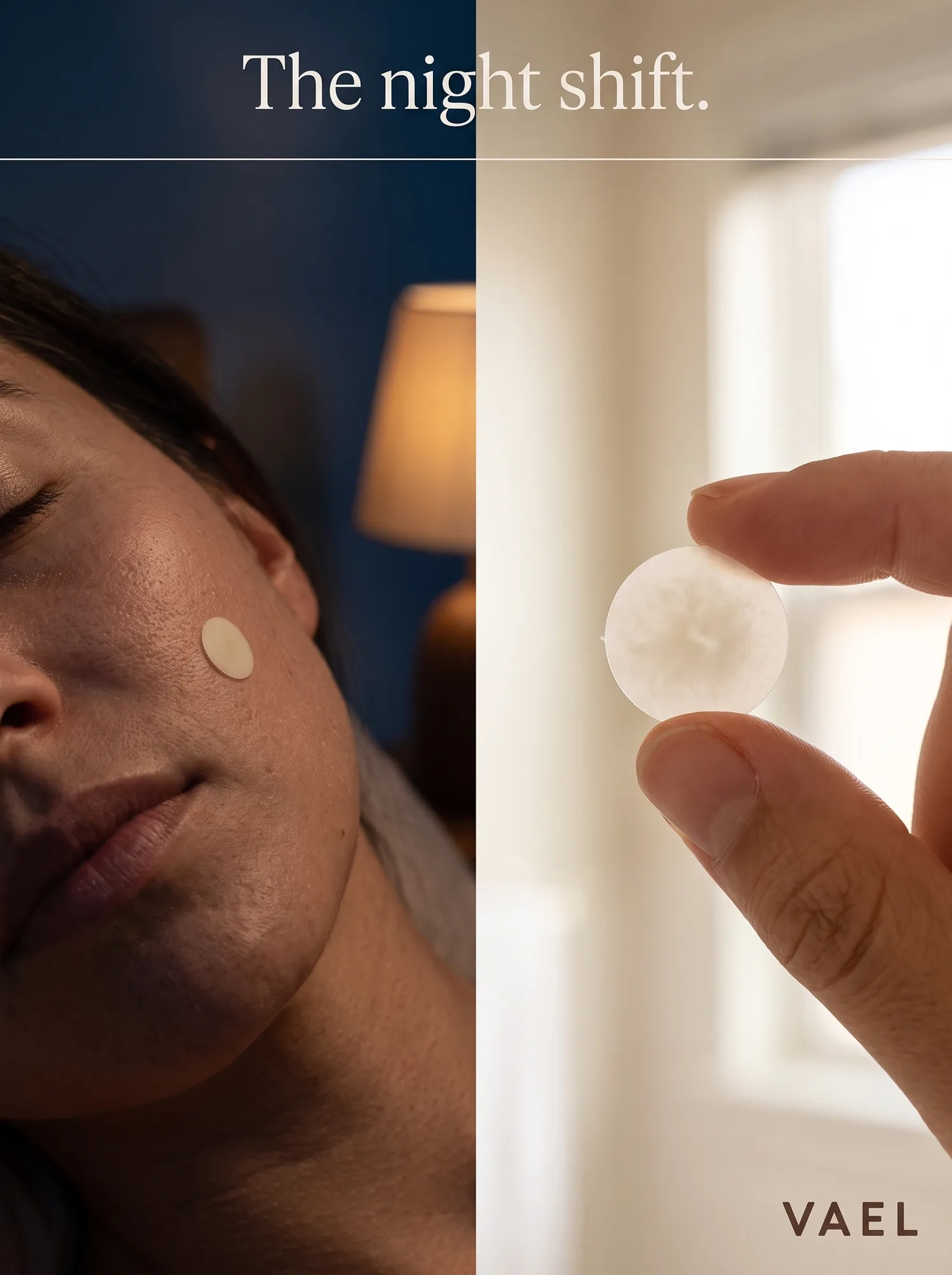
04 — The Night Shift
A diptych: worn at night, held clean the next morning. The only ad in the set that shows the mechanism, restrained rather than graphic.
Why it exists: Answers the rational objection — does it actually work — without breaking the brand's straight-faced tone into clinical territory.
VAEL-26 / 054:5 · Feed
Editorial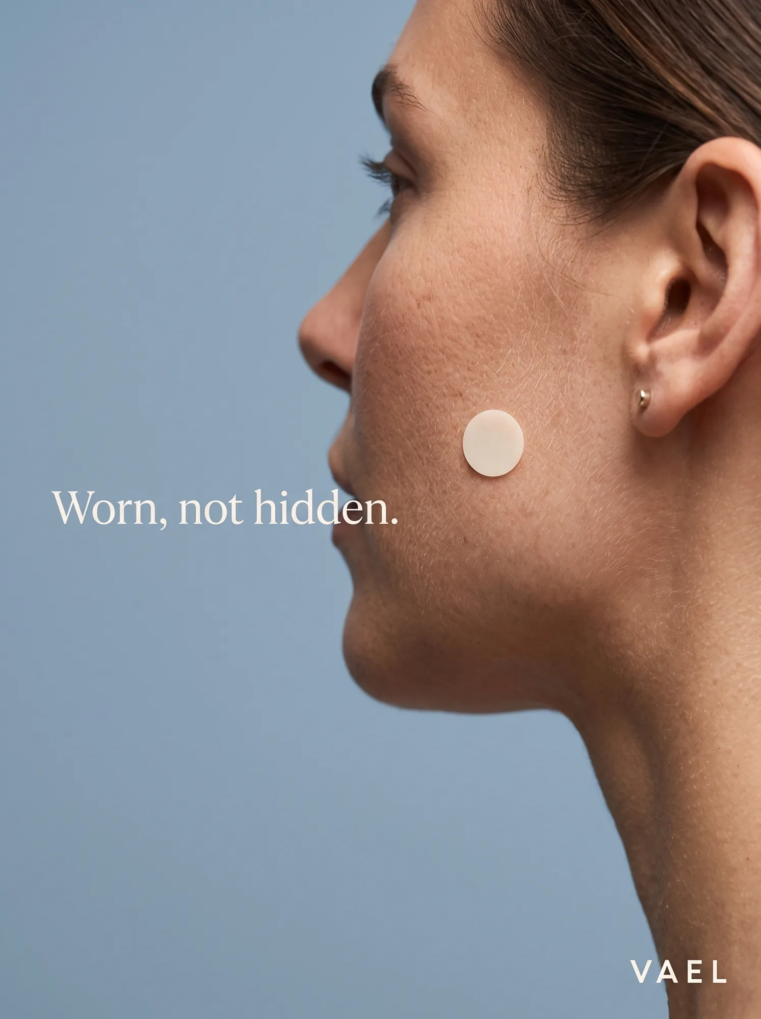
05 — Worn, Not Hidden
Beauty-campaign lighting, a profile crop, one patch treated with the same care as a stud earring. The category's own visual language turned against its instinct to conceal.
Why it exists: Closes the set on the brand's real thesis: a patch styled like jewelry is a different claim than a patch styled like a cover-up.
Craft Notes
What passed the 200% check
[✓] Character design from zero
A pimple with a personality
No reference existed for a creature built entirely from a blemish — the posture had to carry the entire emotional read with no face beyond a suggestion.
[✓] Filter-safe pipeline
Clean plates first, patch composited after
Facial close-ups paired with skin-texture language repeatedly tripped content filters. Solved by generating clean plates first and compositing the patch and copy in Photoshop — the same discipline used for every garbled label across the portfolio.
[✓] Restraint as craft
Proof without graphic
The Night Shift ad needed to show a used patch without becoming graphic — the hardest tonal needle in the set, more editorial judgment than generation skill.