Work / SORA-26
SORA
Before a fragrance house locks a visual system, someone has to render the options. SORA is that exploration — one bottle, four directions, each pushed to a finished ad so the decision is made in front of the work, not the description.
Sector
Luxury Fragrance
Deliverables
Direction study · 4 ad masters · 1 bottle system
Formats
4:5 feed · 1:1 feed · 9:16 story · 4:3 native
Production
AI production, art-directed · type set in Photoshop
Year
2026 · self-initiated
The Brief
What problem the exploration solves
Fragrance houses commit to a visual world before they know which one their scent lives in. A mass-market palette shipped for a quiet-luxury scent kills margin; a Byredo palette shipped for a mass launch kills volume. Most exploration decks solve this with mood boards, which decide nothing.
Skip the mood board. Render each direction as a finished ad, at Meta feed quality, with real headlines set in Photoshop. A decision made in front of four running ads is a different decision than one made in front of four descriptions.
Four directions on one brief — held together by one bottle
One bottle. Four
worlds.
The SORA wordmark, the crystal geometry, and the label are held constant across every ad. Everything else — palette, type, pacing, register — flexes to argue for a different scent position. What survives the exploration decides the house.
The Ads
Four directions — what each one argues
SORA-26 / 014:5 · Feed
Mass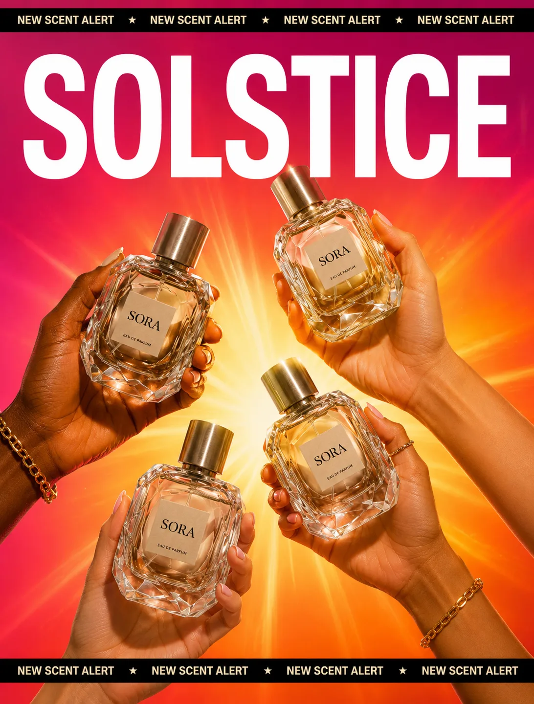
01 — Mass-Market Launch
Fuchsia-to-orange gradient, four hands, product replicated four times, promotional marquee top and bottom. Loudness is the strategy — this direction assumes the scent competes on shelf visibility, not scent story.
Why it exists: Argues the position for a Sephora-tier launch: high-margin volume, price-sensitive shopper, discovery-driven purchase. Wins on scroll velocity; loses the perfumery buyer entirely.
SORA-26 / 024:3 · Native
Quiet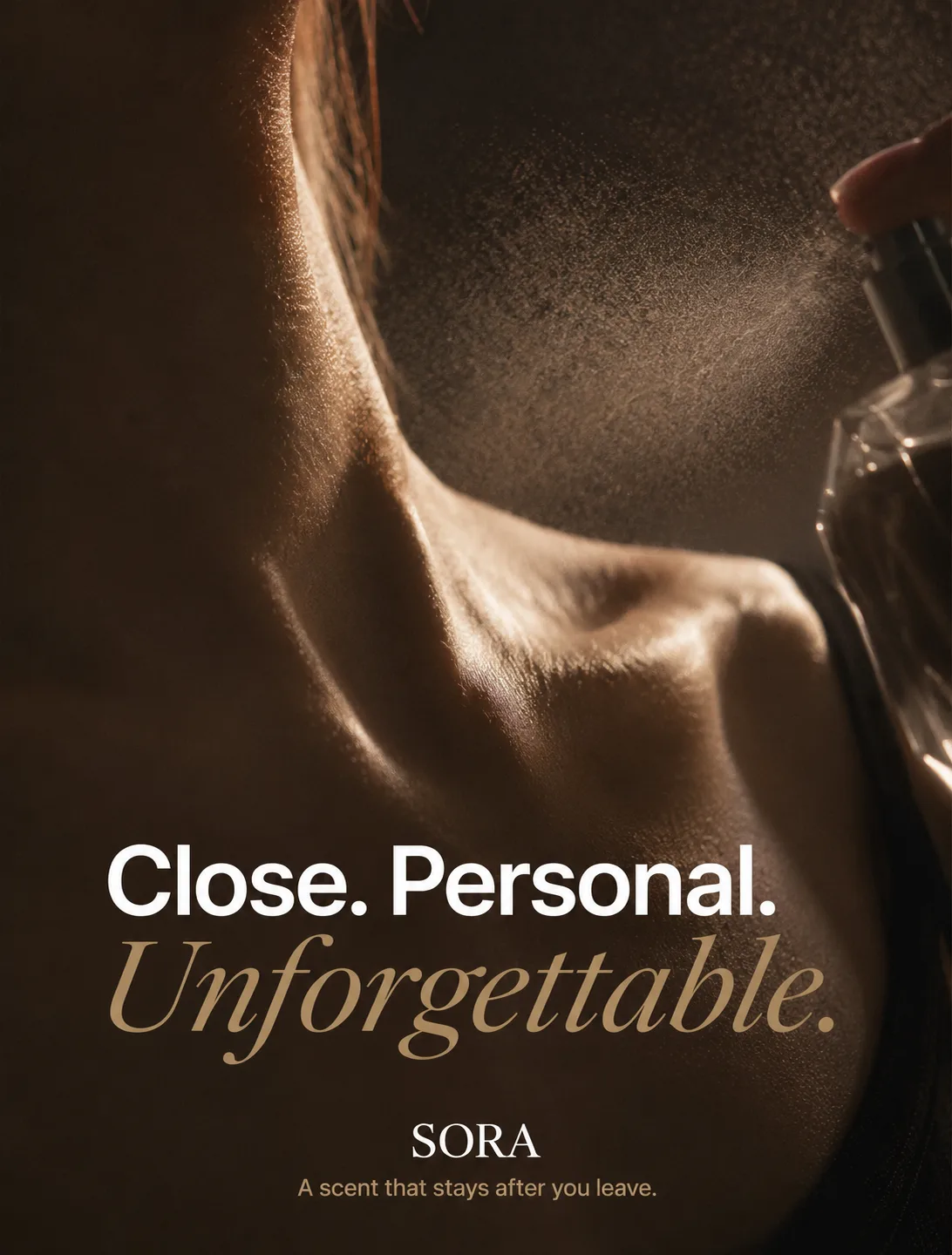
02 — Quiet Luxury
Editorial crop on the collarbone, warm shadow, serif italic pairing on ivory. Restraint is the price signal — the ad refuses to sell so the viewer decides they want it.
Why it exists: Argues the Byredo / Le Labo position: high price, considered purchase, small audience with buying power. Wins the perfumery buyer; forfeits mass reach.
SORA-26 / 039:16 · Story
Sensory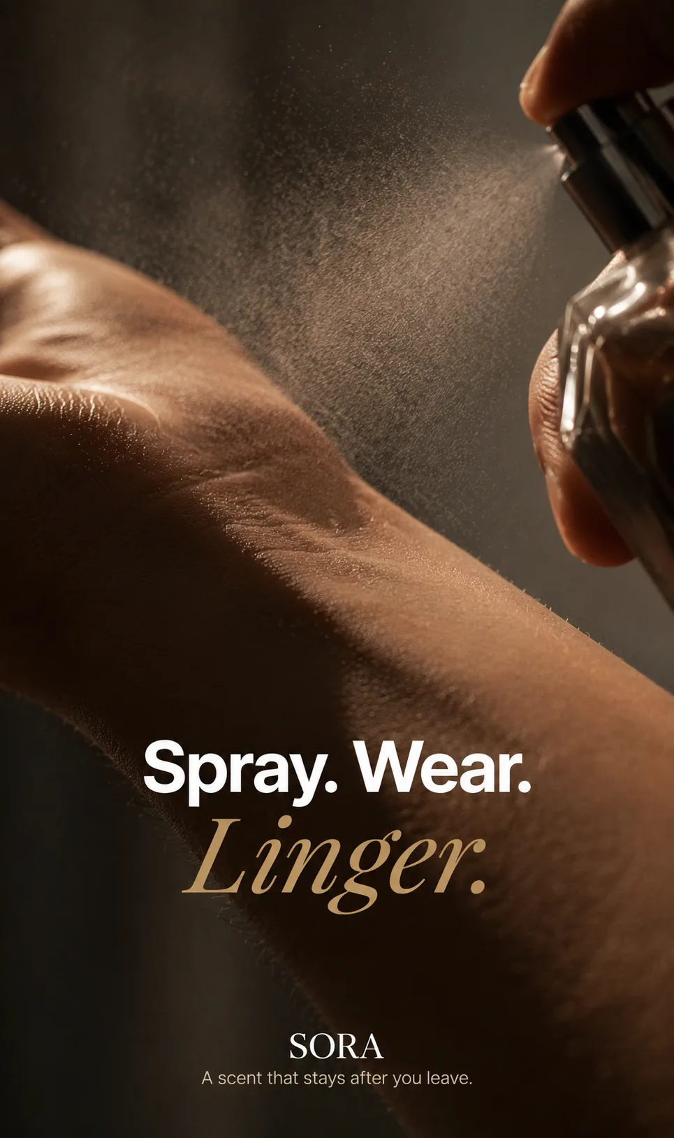
03 — Sensory Intimacy
Wrist mid-spray, warm skin against low light, three-word line stacked serif-below-sans. The sale happens on the verb — spray, wear, linger. The product is the least important object in the frame.
Why it exists: Sister direction to 02, warmer register — argues the same buyer with a more sensory route in. Runs where quiet-luxury reads cold; keeps the price position while raising desire.
SORA-26 / 049:16 · Story
Performance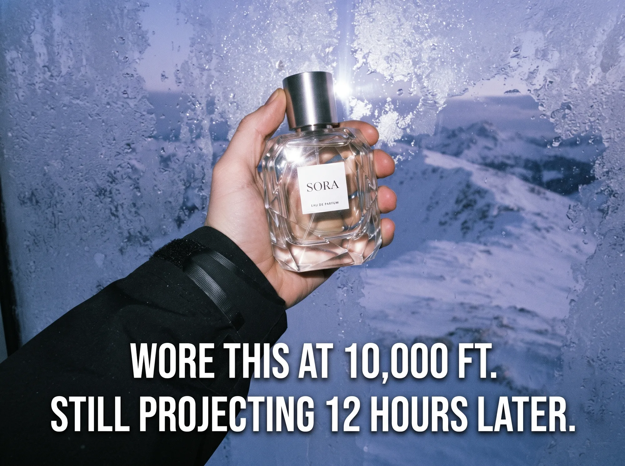
04 — Performance / UGC
Flat handheld frame, alpine backdrop, testimony-format headline in slab caps. The claim is the whole ad — a fact, a number, a benefit. Every stylistic decision gets out of the number's way.
Why it exists: Argues an athletic/outdoor fragrance position (Sol de Janeiro's TikTok era, Phlur's benefit-led ads): mid-price, benefit-driven shopper, TikTok-first. Wins on save-and-share; forfeits the luxury position entirely.
Craft Notes
What passed the 200% check
[✓] Wordmark held
One mark, four palettes
The SORA lockup and label geometry are pixel-consistent across all four directions — composited in Photoshop on every asset, sampled against source, never model-rendered.
[✓] Bottle geometry locked
Same crystal, four lights
The faceted bottle silhouette is preserved frame-to-frame; only lighting, palette, and composition move. The object stays the same object regardless of world.
[✓] Type set by hand
Four typographic systems, zero generated glyphs
Every headline across all four directions is real typography set in post. AI renders the scene; typography is set by hand. The exploration proves visual range without proving typographic drift.