Work / LUME-26
Lumé Skin
DTC skincare's paid-social playbook is fixed: one UGC video, one editorial hero, one before-and-after. Every brand runs it, and every brand's ads look like every other brand's ads. The campaign's job: run the same three-ad structure everyone runs — and make Lumé the one that stops the scroll — and prove Dravn can hit three completely different visual registers on one product.
Sector
Beauty · Skincare · DTC
Deliverables
Campaign concept · 3 ad masters · label system
Formats
4:3 landscape · 4:5 hero · 4:3 comparative
Production
AI production, art-directed · type set in Photoshop
Scope
Full ad set for a paid-social launch
Year
2026 · self-initiated
The Brief
What problem the campaign solves
The three-ad DTC skincare campaign is a solved structure — UGC for social proof, editorial hero for brand credibility, before-and-after for the rational buyer. The category runs this exact set on Meta every day. The problem isn't the structure; it's that every brand executes it identically. Same amber bottle on marble. Same influencer in a bathroom. Same left-to-right glow reveal. The buyer's brain filters the entire register as category noise.
Keep the structure. Break the visual defaults. Each ad has to look like it came from a different studio — one truly reads UGC (bathroom light, real skin, TikTok caption), one truly reads editorial (dappled marble, model-quality face, luxury type), one truly reads clinical (hard split, before-and-after, competitor strikethrough). Same bottle, three visual worlds. The scroll doesn't stop because the register is loud — it stops because the register is specific.
The device — repeats across every ad
One bottle. Three ads.
The Lumé Vitamin C bottle appears in all three ads with the same label, the same amber glass, the same gold dropper. Everything else — lighting, subject, typography, framing — flexes to match the register. What holds the campaign together is the object. What separates the ads is which studio they claim to have come from.
The Ads
Three registers. One product. No overlap.
LUME-26 / 014:3 · UGC
Ugc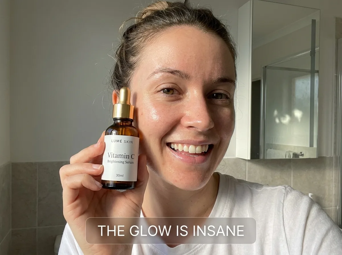
01 — Social Proof
Bathroom light, phone-shot framing, natural skin texture visible, TikTok-style caption pill overlay. The ad refuses to look like an ad — no studio lighting, no styling, no editorial polish. If it looks like content the algorithm surfaced from someone's grid, it works.
Why it exists: Cold audiences on Meta and TikTok who have learned to scroll past polished creative. This frame runs in Reels and Stories placements where the native register is user-generated. Its job is pass the pattern-match test — read as a real person before it reads as a brand.
LUME-26 / 024:5 · Feed
Hero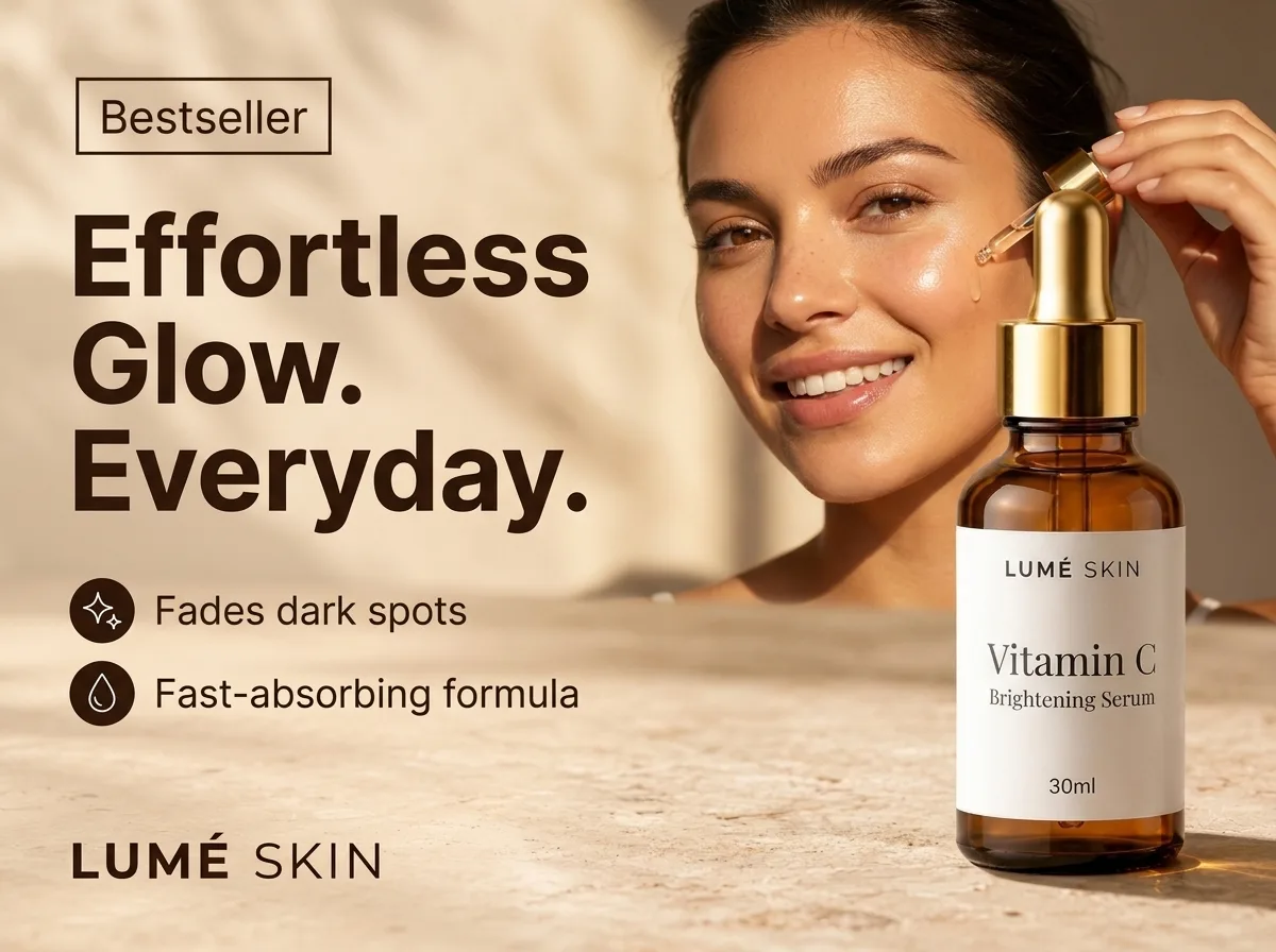
02 — Brand Credibility
Warm dappled marble, model-quality face, gold dropper mid-application, "Bestseller" badge, headline in serif-sans hybrid, two-bullet feature list, wordmark. The ad claims the position the brand wants to occupy — bestseller before it is one.
Why it exists: Warm audiences on Meta who have seen Ad 01 and are checking if the brand is real. This frame's job is raise the register — prove Lumé plays in the same visual league as Glossier, Summer Fridays, or Youth to the People. The bestseller badge is aspirational, not descriptive, but the buyer doesn't know that; they only know the ad looks like one.
LUME-26 / 034:3 · Comparative
Compare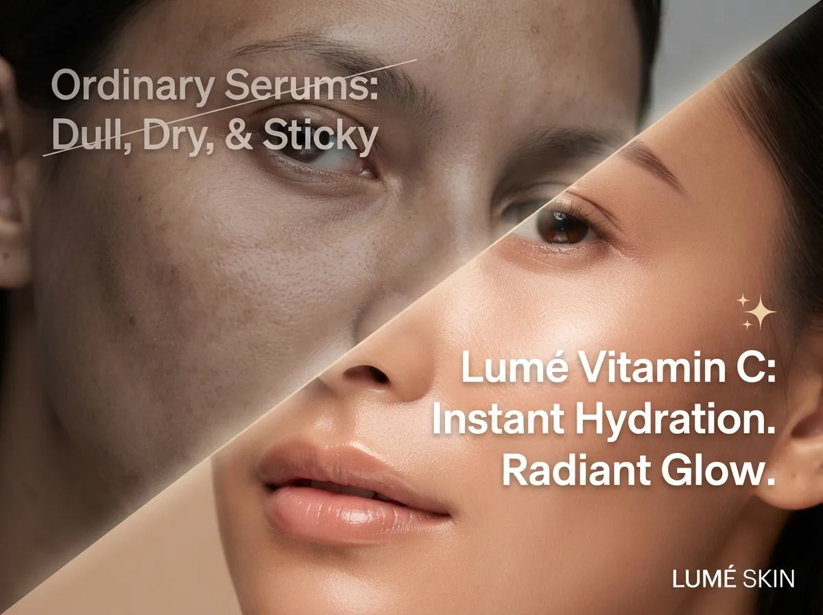
03 — Rational Proof
A single diagonal split — same face, two states. Left half muted and textured, right half glowing and clear. Left type crossed out; right type asserts. The ad makes the promise legible in half a second — the buyer's brain has already resolved the argument before they read the wordmark.
Why it exists: Warm-to-hot audiences who have visited the site or added to cart. This frame's job is close the rational objection — the buyer already wants to believe the ad; this frame gives them the visual permission to convert.
Craft Notes
What passed the 200% check
[✓] Three registers, one bottle
The product survives the register shift
The Lumé bottle — amber glass, gold dropper, "LUMÉ SKIN / Vitamin C Brightening Serum / 30ml" label — renders pixel-consistent across all three ads despite three entirely different lighting environments. Bathroom fluorescent (Ad 01), warm afternoon marble (Ad 02), and clinical split-frame (Ad 03) each pull the object into a different world; the object survives all three.
[✓] Real skin, not model skin
Freckles, pores, and micro-texture held
Every face in the campaign renders with visible skin texture — pores, freckles, natural highlight micro-variation. The UGC ad's face reads unretouched. The hero ad's face reads lightly retouched, matching category convention. The split ad's two faces read like the same face at two skin states. AI beauty ads default to plastic; these don't.
[✓] Register discipline
Each ad refuses the others' typography
The UGC ad uses a system caption pill (Instagram/TikTok native). The hero ad uses a serif-sans hybrid on marble. The comparative ad uses clean sans in a split composition with a strikethrough. Three ads, three type systems, zero drift. A campaign that doesn't look like a campaign is doing its job.