Work / KITO-26
Kito Chai
Kenya drinks more tea per person than almost anywhere on earth, but every packaged tea ad looks the same: steam, a cup, a claim. The campaign's job: make one brand feel like Kenya's — from the field it's grown in to the moment it's served — and prove Dravn can hold a system across four registers without breaking the brand.
Sector
FMCG · Tea · Kenya
Deliverables
Campaign concept · 4 ad masters · brand identity
Formats
3:4 feed · 4:5 editorial · 9:16 story-ready
Production
AI production, art-directed · type set in Photoshop
Languages
English primary · Swahili packaging fluency
Year
2026 · self-initiated
The Brief
What problem the campaign solves
Kenya is a tea country — the second-largest tea exporter in the world, and a nation where chai is the default gesture of welcome. But domestic tea advertising runs on the same three visuals everyone else uses: hard-lit steam, a lone cup, a promise about strength. The category signals commodity; buyers who want meaning have nowhere to look.
Skip the steam. Build the campaign as a supply chain instead — one ad per moment the tea passes through: field, designed object, shop, home. Each ad has its own visual register. What holds them together is one repeating phrase and one pouch.
The device — repeats across every ad
Every day.
Two words in every ad — headline, subhead, or sign-off. The line doesn't argue the tea's quality; it argues its place in the day. Origin, market, home, ritual — all four ads answer the same phrase differently, so the set reads as one campaign about one habit, not four style tests on one bottle.
The Ads
Four registers. One phrase. One pouch.
KITO-26 / 013:4 · Feed
Field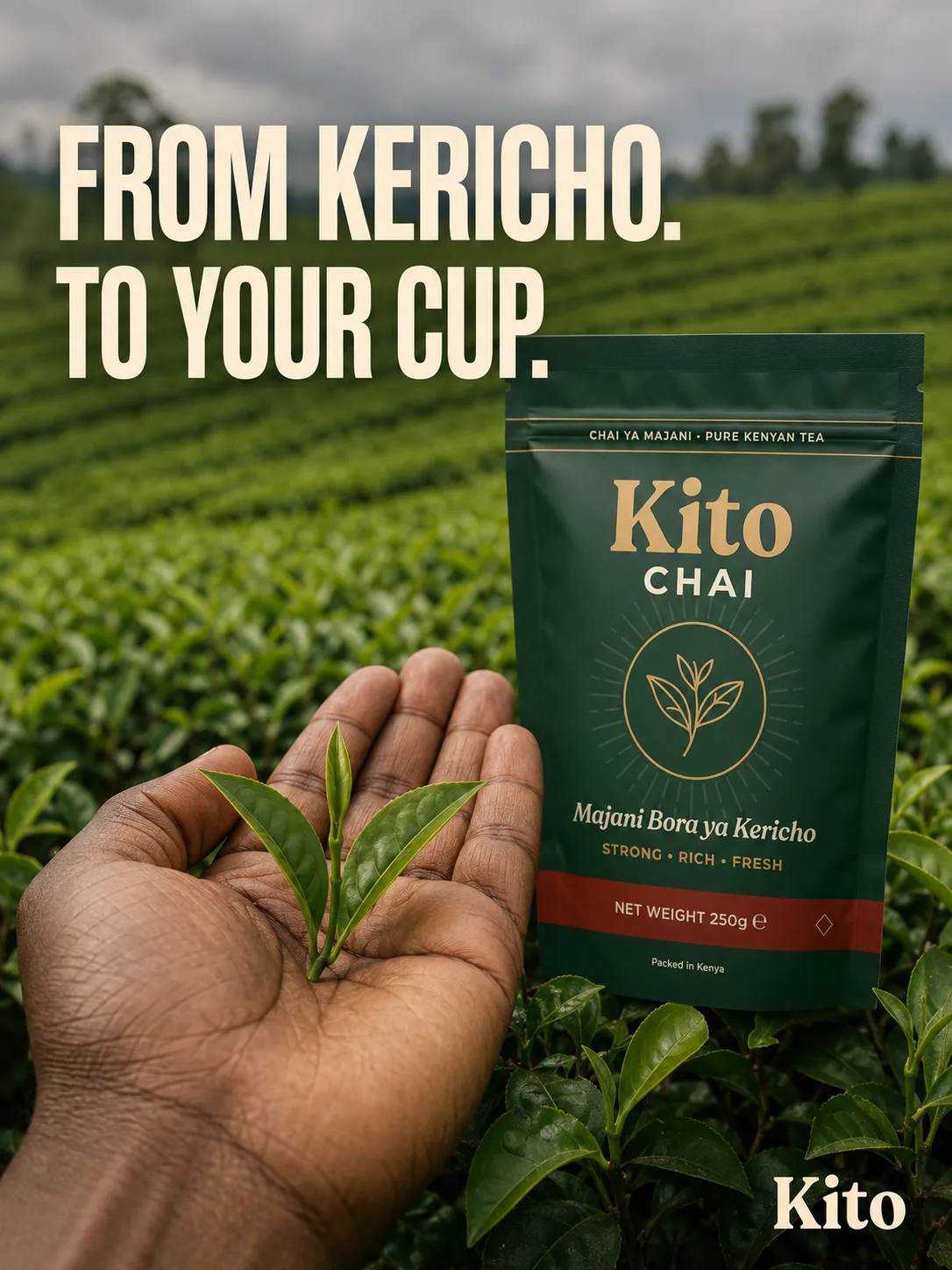
01 — Origin
A single hand with two-leaves-and-a-bud, Kericho highland field behind, pouch composited to the right. The origin claim made literal — the tea is here, the pouch is here, the distance between them is nothing.
Why it exists: Argues the supply-chain claim other brands only print on the back. Runs to cold audiences skeptical of packaged tea — this frame says the leaves you're drinking came from a place, and someone's hand carried them.
KITO-26 / 023:4 · Feed
Shop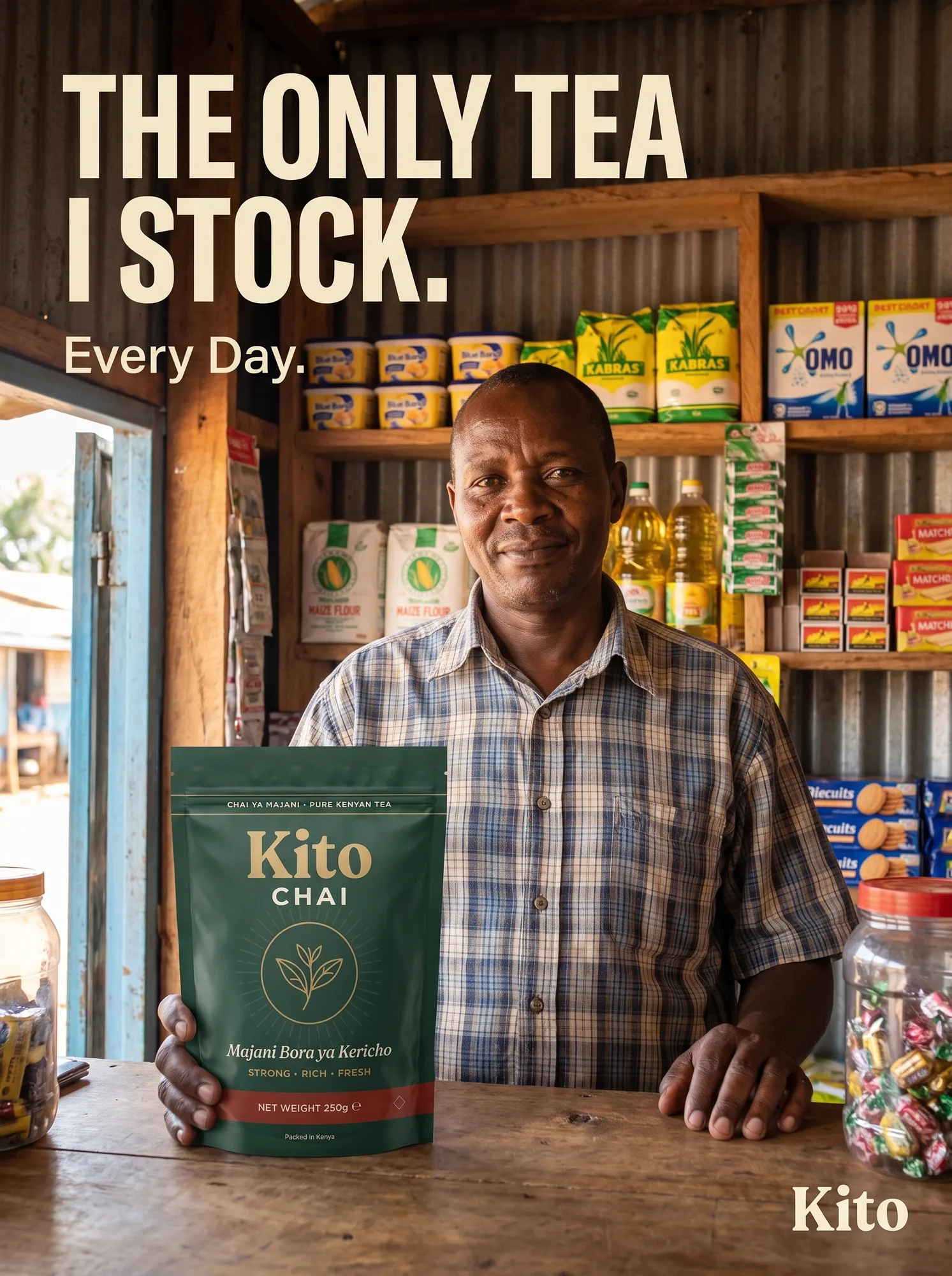
02 — Market
A Nairobi duka owner, real shelves behind him — Blue Band, Kabras, Omo, matchboxes — holding the pouch as testimony. The person selling the tea is the person drinking it.
Why it exists: UGC-testimony register applied to retail distribution. Runs to warm audiences deciding between brands at the shelf — this frame argues ask any duka in Nairobi and they'll tell you the same thing. No paid endorsement fiction; it's the position the retailer already holds.
KITO-26 / 033:4 · Editorial
Object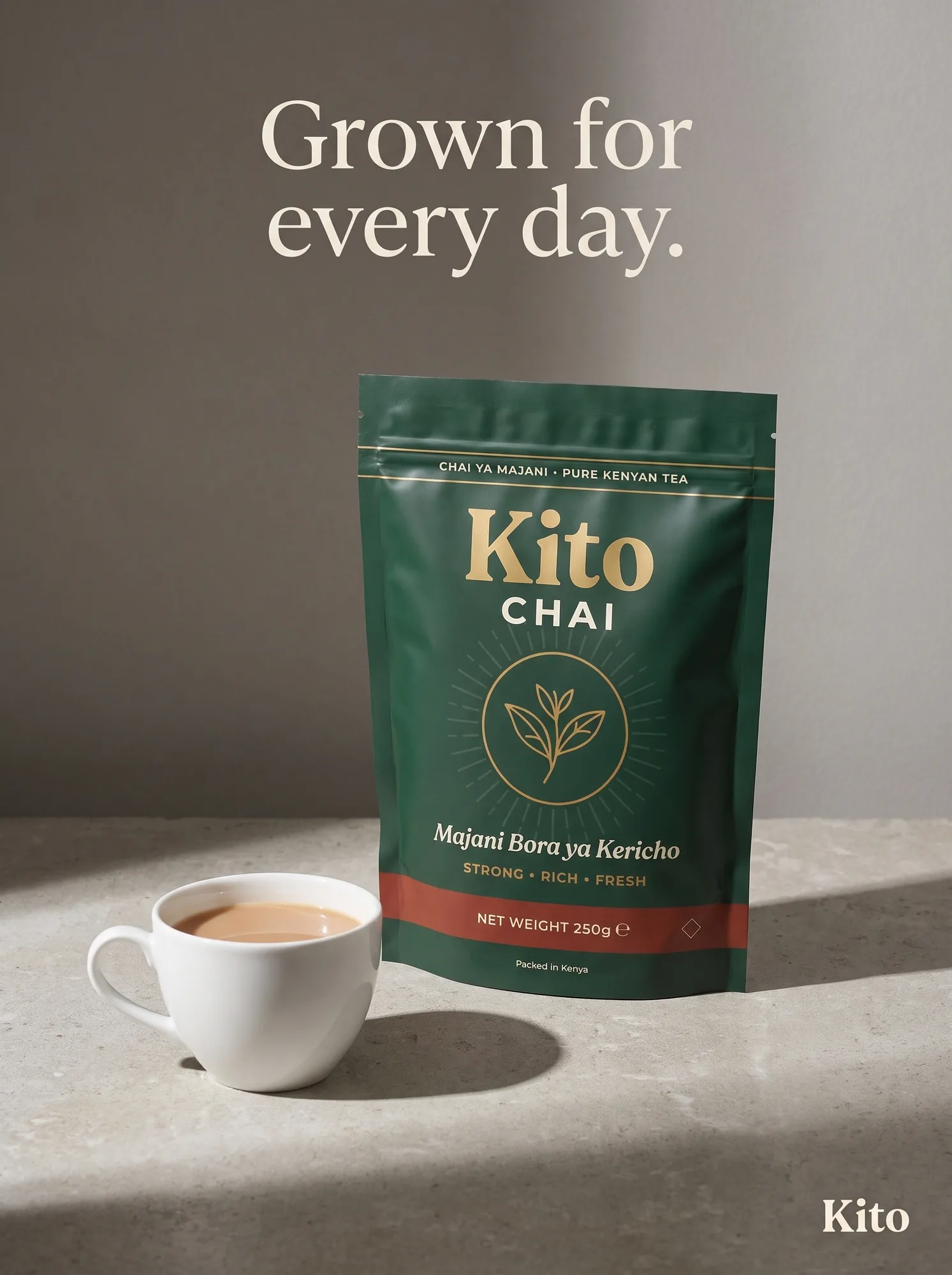
03 — Ritual
Pouch and cup, single hard light, designed shadow. Concrete surface, muted palette, serif type. The tea as a considered object — everything else in the campaign gets stripped away.
Why it exists: Argues Kito could sit in a design magazine if the brand wanted it to. Runs as editorial partnerships, print, or high-craft feed placements. This frame's job is range upward — proof the brand isn't only a Meta ad.
KITO-26 / 043:4 · Feed
Home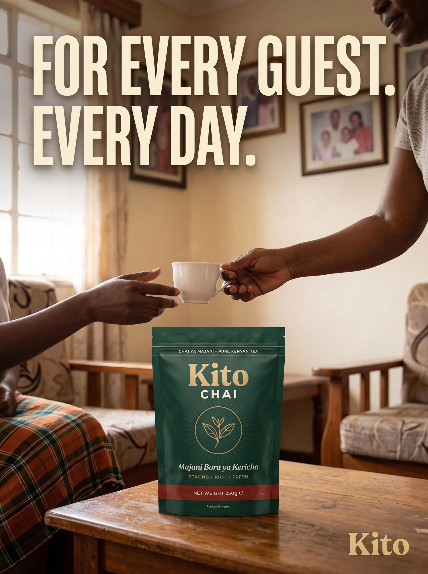
04 — Welcome
Two arms meeting over a wooden coffee table, cup mid-exchange, pouch as the still center. The pouch witnesses the moment the tea does its actual job — welcoming someone in.
Why it exists: Closes the campaign loop. The tea has traveled from field (01) through shop (02), been considered as an object (03), and here it becomes what it was always for. This is the emotional peak — the frame the campaign builds toward.
Craft Notes
What passed the 200% check
[✓] Packaging held
Same pouch, four worlds
The Kito Chai pouch appears in every ad, and every text zone on it — wordmark, "Chai ya Majani · Pure Kenyan Tea," "Majani Bora ya Kericho," "STRONG · RICH · FRESH," "NET WEIGHT 250g," "Packed in Kenya" — passes a 200% zoom check on all four masters. No pseudo-text, no phantom letters, no macron drift.
[✓] Swahili verified
Packaging in Swahili, campaign in English
The pouch's Swahili copy ("Chai ya Majani," "Majani Bora ya Kericho") is verified by a native reader — never shipped on model output alone. Campaign headlines run in English for reach; the Swahili on the packaging is the cultural anchor that proves the brand is Kenyan, not styled to look Kenyan.
[✓] One pouch, one device
The system a set actually needs
The word "day" repeats across all four ads — as headline, subhead, or sign-off. The pouch appears in every frame at the same scale relative to the composition. The Kito sign-off sits bottom-right on every ad. Three consistencies hold the set together while four registers argue different points.
What this would test
Concept work argued as a strategic bet, not just craft
HypothesisA packaged tea brand earns trust faster by showing where the tea comes from and where it ends up than by leading with a strength or quality claim.
Primary metricHook rate — 3-second video view / thumb-stop rate on the static crop
Cold traffic01 — Origin. The supply-chain claim is the reason to stop scrolling for a buyer who's never trusted packaged tea before.
Retargeting04 — Welcome. Once the origin claim has landed, this ad closes on the moment the tea was always for — poured for a guest at home.