Work / FOND-26
Fond.
Cold brew is a $500M category in the US where every brand looks like every other brand: kraft labels, hand-drawn type, "artisan" this and "small-batch" that. The campaign's job: launch a cold brew that reads like a design object, not a farmers-market booth — and prove Dravn can build a brand from the bottle up.
Sector
Beverage · Coffee · DTC
Deliverables
Brand identity · Bottle system · 3 launch ads
Formats
4:3 comparative · 9:16 story · 9:16 story
Production
AI production, art-directed · type set in Photoshop
Scope
Full stack — product design through launch creative
Year
2026 · self-initiated
The Brief
What problem the campaign solves
Cold brew's category convention has calcified. Every bottle wears the same uniform: kraft paper, apothecary silhouette, hand-drawn type, "cold brew" written like an artisan is apologizing for it. The design signals effort, not result. Buyers who want convenience — the actual promise of ready-to-drink coffee — read the category and reach for a can of Starbucks instead.
Design against the category. Clear bottle, serif wordmark, "slow cold brew" as a whispered tag — signals considered, not rustic. Then price the ads against the coffee shop, not the shelf. Every ad answers the same question the buyer is actually asking: is this worth the switch?
The device — repeats across every ad
Coffee, reconsidered.
Every Fond ad argues the same thesis differently: coffee is a habit, and Fond makes that habit better in a specific way. Ad 01 argues cheaper than your barista. Ad 02 argues simpler than your machine. Ad 03 argues sharper than your afternoon slump. Three different objections, one repeating position — cold brew as the considered choice, not the compromise.
The Ads
Three objections. Three answers. One bottle.
FOND-26 / 014:3 · Landscape
Vs. Barista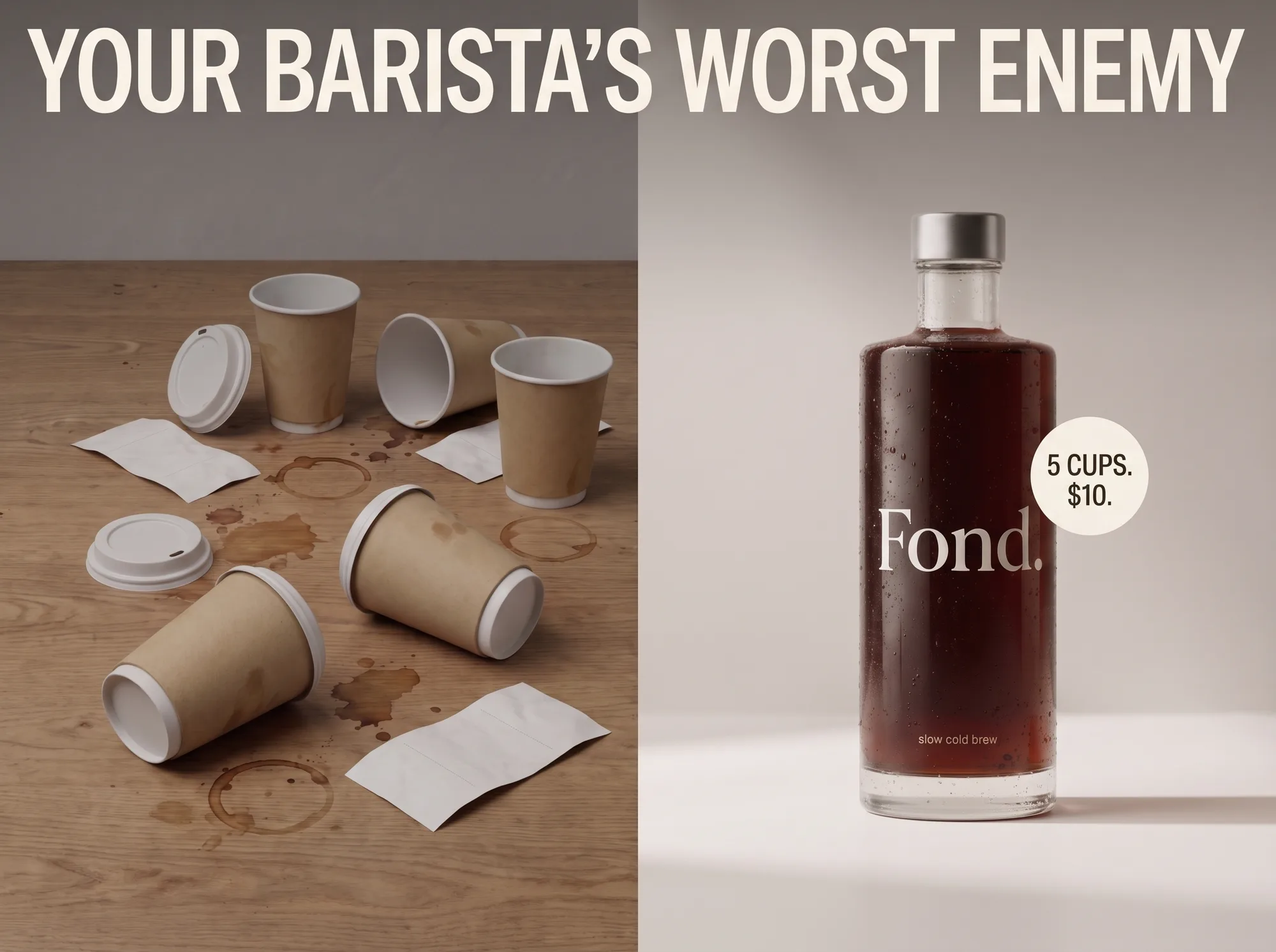
01 — Price
Split composition: five paper cups, coffee rings, receipts on the left; one bottle, clean light, "5 cups. $10." badge on the right. The comparison IS the ad — no need to name the competitor when the visual language does it for you.
Why it exists: Argues the daily-coffee spender who already knows their monthly total. Runs to warm audiences on paid social who have been served a Starbucks ad in the last 24 hours — this frame's job is make the math visible.
FOND-26 / 029:16 · Story
Vs. Machine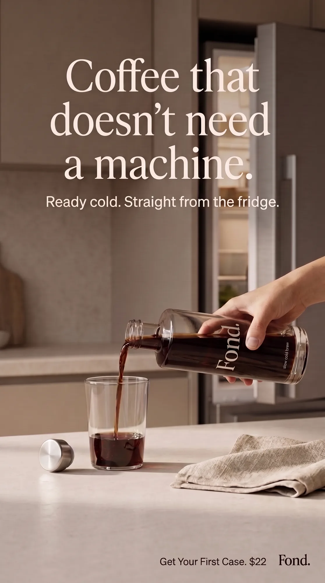
02 — Convenience
A single pour, kitchen interior, fridge open in the background. Elegant serif headline, subhead in sentence case, CTA + price bottom-right. The frame shows the entire product experience in one gesture — pour, drink, done.
Why it exists: Argues the home-brewer who invested in a Nespresso, an Aeropress, or a French press and doesn't want to argue with any of them at 7am. Runs to warm audiences who have expressed interest in home coffee equipment — this frame's job is make the machine feel like the effort it is.
FOND-26 / 039:16 · Story
Vs. Slump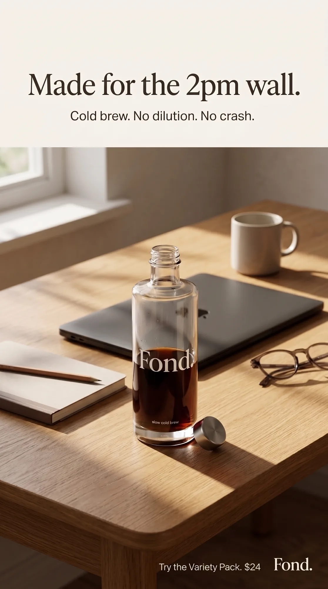
03 — Moment
The bottle on a work desk in warm afternoon light. Serif headline names the moment ("2pm wall"), subhead names the mechanism ("cold brew, no dilution, no crash"), CTA offers the variety pack. The ad describes the buyer's Tuesday afternoon — recognition IS the hook.
Why it exists: Argues the knowledge worker who has learned that a third coffee at 2pm ruins their sleep at 10pm. Runs to warm audiences on LinkedIn, work-adjacent Meta placements, or newsletter sponsorships — this frame's job is be there when the objection is happening in real time.
Craft Notes
What passed the 200% check
[✓] Brand from scratch
Bottle, mark, and system built together
The Fond wordmark, bottle silhouette, and "slow cold brew" tagging are designed as one system, not adapted from a template. Every ad uses the same bottle geometry, the same wordmark position, and the same clean-glass presentation — so three ads read as one product.
[✓] Type set by hand
No generated glyphs, three ads deep
Every headline, subhead, price badge, and CTA across all three ads is typeset in Photoshop. Serif for the direct-response ads, condensed sans for the comparative ad — different registers for different objections, but zero model-rendered letters anywhere on any master.
[✓] Liquid physics held
The pour survives the QA bar
The stream in Ad 02 renders as real liquid — meniscus curvature, splash geometry, and glass refraction all pass a 200% check. Liquid physics is one of the highest-failure zones in AI product photography; this ad passes the same forensic pass Dravn runs on every food-and-beverage asset.